Lecture 29 (10-Apr-13)
Return to Main Index page Go back to notes for Lecture 28, 8-Apr Go forward to Lecture 30 , 12-Apr-13
As the first step in discussing population regulation, we will look at the interplay between density-dependent (DD) forces and density-independent (DI) forces from a graphical perspective. The graphs will be somewhat similar to the harvest graphs of Lecture 23. That is, they will have N on the X-axis and dN/dt plus linear functions on the Y-axis.
We will incorporate the DD forces via logistic influences of a population's density-impact on itself. The DD forces produce humped dN/dt curves (look back at Fig. 6.1 of Lecture 6). "Good" DD years have higher maxima (top of the hump) and larger K (how far the end of the hump goes out the X-axis, describing N). "Bad" DD years have lower maxima and left-shifted K. We will incorporate the DI forces via "harvest-like" linear functions. Strong DI (more animals taken out by a factor such as bad weather) means a steeper slope.
The "currency": we will measure the impact of DI and DD on equilibrium population size, N*. [As so often in this course, we will look for stable points and equilibria – places the system will move toward and stay at].
A graphical analysis of the interaction between density-dependence and density-independence:
Motivation and system setup:
Imagine that we have both some density-dependent (DD) and density-independent (DI) factors influencing the population of a species of interest. For concreteness, say that the population is the Wyoming toad (Bufo baxteri). Use the following characteristics and assumptions for modeling the system:
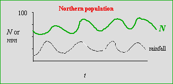
1) Let the DD factor be predator load (whose per capita effect changes as the toad population changes)Now, say we are monitoring two populations of toads -- a "northern" population at the north end of the Laramie Basin and a "southern" population at the south end. We get population fluctuations that look like the two graphs below.
2) Let the DI factor be rainfall (whose per capita effect is constant regardless of the population size).
3) Good DD years have low predator loads, bad DD years have high predator loads;
4) Good DI years have high rainfall, bad DI years have low rainfall.
5) Assume that the DI variation is as large, or larger, than the DD variation.
6) Finally, assume predator load (DD) and rainfall (DI) vary independently (that is, they are not correlated).
Fig. 29.1. Population fluctuations of a toad's population size (N) and rainfall (in mm) over time (t) for the "northern" population. Black, dashed line: rainfall, with a mean of approximately 25 mm per year, ranging from approximately 10 to 40 mm. Over the same time period, the population fluctuated from approximately 50 to 90 individuals, with an approximate mean of 70. Note that the population "tracks" rainfall fairly closely -- with a slight lag.In the northern population, rainfall gives us a pretty accurate indicator of population trends. Shortly after rainfall peaks we will tend to get population peaks. [Depending on the (unspecified) time scale, this might mean that the population responds with a one-year time lag to changes in rainfall -- this might be because we census "adult" toads and the high numbers this year represent good recruitment last year].
The good correlation in the northern population contrasts with the lack of correlation shown in the graph below for the southern population.
Why does the northern population "track" rainfall, while the southern population doesn't?
Fig. 29.2. Population fluctuations of a toad population (N) and rainfall (in mm) over time (t) for the "southern" population. Black, dashed line: rainfall, with a mean of approximately 25 mm per year, ranging from approximately 10 to 40 mm (the rainfall is the same at both sites). Over the same time period the population fluctuated from approximately 65 to 75 individuals, with an approximate mean of 70. Note that rainfall is poorly correlated with population trends.
I will use a revised version of one of the harvest models we examined earlier ( Lecture 23) to address one way of examining/modeling the patterns given in Figs. 29.1 and 29.2.
We will have humped curves, depicting intrinsic density-dependent (DD) factors
(effect varies with density: low growth at small N, to high growth at intermediate N, then back to low) via logistic growth.
We will have straight lines, depicting density-independent (DI) factors that affect population
growth (they affect an unchanging proportion of the population). We will allow the density-dependent factors to vary between "good" (higher
humped blue curves, with higher K) and "bad" (lower humped blue curves, with lower K).
The density-independent factors will vary between "strong" (steeper-sloped dashed straight lines) and "weak"
(shallower-sloped dashed lines).
Our approach will be to assess the difference between equilibrium population size under one combination of regulating forces versus some other combination. We will ask the question: "What makes the biggest difference: DI differences (strong vs. weak) or DD differences (good vs. bad)?"
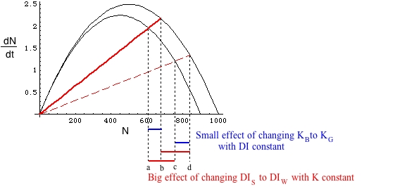
Let's contrast a case where the DI effects are relatively weak (shallow lines of Fig. 29.3) with a graph showing stronger DI effects, given below in Fig. 29.4.
Fig. 29.3 Interaction between density-dependent (DD) effects on population growth (solid blue curves) and density-independent (DI) effects (red, dashed lines). The difference between good and bad years is large for DD effects (differences a minus b and c minus d, holding the DI effects constant), compared to the difference between strong and weak DI effects (a minus c and b minus d, holding the DD effects constant). Note that points a, b, c, and d represent equilibrium population sizes -- the sizes at which addition (blue DD curves of logistic growth) are balanced by subtraction (red, dashed DI curves of density-independent removal). Four curve intersections means four equilibrium points.
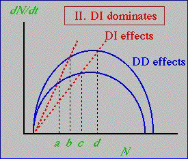
Fig. 29.4. Interaction between density-dependent (DD) effects on population growth (solid blue curves) and density-independent (DI) effects (red, dashed lines). With the steeper DI lines, the relative importance of DI and DD are reversed when assessing effects under variation. The difference between good and bad years is now large for DI effects (a minus c and b minus d, holding the DD effects constant) compared to those for DD effects (differences a minus b and c minus d, holding the DI effects constant).
What are some major differences between the forces acting in Figs. 29.3 and 29.4?
1) In Fig. 29.3 the density-dependence is more dramatic (difference between K in good vs. bad years is greater)
2) In Fig. 29.3 the density-independence is weaker (both curves have lower slope than in Fig. 29.4)
3) In Fig. 29.4 we have decreased the DD good-bad difference
4) In Fig. 29.4 we have increased the impact of DI factors (made the lines steeper).
If we use the same notation to label the points as a, b, c, and d, then DD dominates when b > c, while DI dominates when b < c.
Outcome: DD dominates in Fig. 29.3, while DI dominates in Fig. 29.4.
Now we will turn to an equation-based analysis of the same issues.
Equation-based exploration of DI vs. DD as the main regulating force:
NOTATION: for all the graphs and equations below, I will use the subscript "G" to refer to parameters associated with Good DD years, and "B" to refer to parameters associated with Bad DD years. I will use the subscript "S" to refer to Strong DI impacts (more animals taken out, steeper slopes) and "W" to refer to Weak DI impacts (fewer animal taken out, shallower DI slopes).
Base equations for the four curves (all of them are dN/dt type differential equations):
DDG = rN(1-N/ KG) Eqns 29.1
DDB = rN(1-N/ KB)
DIS = RSN
DIW = RWN
where the first two are simply the logistic equation -- with a subscript on the K. Look back at Fig. 6.1 to remind yourself that the graph of logistic dN/d t against N is a humped curve. The second two are linear (Y-intercept is 0, slope is Ri, where the i subscript can be S strong effect, or W, weak effect). Think of the Ri as a proportion of the animals removed by the DI factor (that DI factor could be harvest, weather mortality, or something else). The four equations 29.1 produce the four blue or red curves of Figs. 29.3 and 29.4. Remember, the DD are adding animals, while the DI are removing animals. The combination of the humped curve for the addition and the linear increase for the removal is very similar to what we looked at with linear harvest (see Fig. 23.3).
The four curves lead to four values of N where DD and DI curves will intersect – the equilibrium points. We will use the symbol "&" to mean intersection. DIS&DDB , for example, will mean the intersection of the DIS line and the DDB curve. We can solve for N at those intersection/equilibrium points by setting pairs of the equations in 29.1 equal to each other. Those intersection N-values are given by:
a = DIS & DDB = KB [1- (RS / r)] Eqns 29.2Question to ponder: If we get a "verdict" from the {a to c} and {a to b} distances, are those automatically the same as the verdict from the {b to d} and {c to d} distances?
b = DIS & DDG = KG [1- (RS / r)]
c = DIW & DDB = KB [1- (RW / r)]
d = DIW & DDG = KG [1- (RW / r)]
The "switcher" intersections are b and c. Their relative magnitude will determine whether DD or DI will dominate.
[Note that a is always less than b, and c is always less than d, but the order of b and c can vary, as we will see in some of the graphs below]. Again, remember that each of these is an equilibrium point under a given combination of conditions.Why b and c matter (using a as the reference point):
DI dominates: If b < c then a to b (changing DD while holding DI constant) is
shorter than a to c (changing DI while holding DD constant)
Small (a to b) distance means that the effect of changing DD is small -- DI dominates.
Large (a to c) distance means that the effect of changing DI is large -- DI dominatesDD dominates: If b > c then a to b (changing DD while holding DI constant) is
longer than a to c (changing DI while holding DD constant)
Large a to b means that the effect of changing DD is large -- DD dominates.
Small a to c means that the effect of changing DI is small -- DD dominates
Let's go back to the idea of using the difference between DI and DD intersections (the change in equilibrium values as we change conditions) to decide which one dominates.
What does the order of b and c mean again?
If b < c then a-b and c-d (changes in DD holding DI constant) are small relative to a-c and b-d (changes in DI holding DD constant). That is, the change in the equilibrium population size across DI changes is small relative to the change in equilibrium population size for DD changes. Compare the graphs of Figs. 30.1a and 30.1b as examples.
In the Fig. 29.5 case [small variance (DI)] the effect on N of DI changes is minor compared to the effect of DD changes.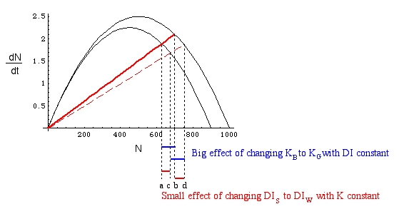
Fig. 29.5. DD dominates. Big {a to b} and {c to d}. Dashed lines and a-b, c-d (etc.) "effect" notes are intended to provide context for the meaning of the order of b and c to be compared with Fig. 29.6.
Fig. 29.6. DI dominates. Compare and contrast with Fig. 29.5. The horizontal red and blue bars below the graph illustrate the effect on N (measured along the X-axis) of changes in DI or DD effects (given by the two humped curves and the two slanting red solid or dashed lines). By increasing the difference between the solid DIS and the dashed DIW lines we have switched from DD dominance to DI dominance.
In the Fig. 29.6 case [large variance(DI)] the effects on N are reversed.
Let's try two different approaches to answering questions about DI vs. DD. The first will be a "numerical and word-problem" approach, the second will be graphical. Both will share certain characteristics.
Numerical, word problem approach: Say I give you the following "data"
N* is one of the four numerical (X-axis) values of the intersection between a DD and a DI curve. [Remember, those intersections are equilibrium points obtained by setting the RHS of equations equal and then solving for N. Look back at Lecture 23 for a very similar problem of linear harvest equilibrium points]. I provide the warning that the points are given in no particular order, and ask that you decide (and explain how you did so) whether DD or DI will dominate.
N* Intersect. 630 DIW & DDB 495 DIS & DDB 700 DIW & DDG 550 DIS & DDG
How should you approach the problem? Our main interest is the effect (on N* the expected net growth produced by DD - DI). What factors affect the effect? The DD and DI curves.
Effect of X holding Y constant vs. effect of Y holding X constant, should tell us which matters most. In this case, the X and Y are DD and DI. How do we evaluate the effect? We assess the effects as the difference between good and bad ,or weak and strong, holding the other factor constant.
In no particular order:
effect of DI while holding DD constant on DDB curve: 630 - 495 = 135
effect of DI while holding DD constant on DDG curve: 700 - 550 = 150
effect of DD while holding DI constant on DIS line: 550 - 495 = 55
effect of DD while holding DI constant on DIW line: 700 - 630 = 70
Verdict? The DI effects (both > 100) are considerably larger than the DD effects (both < 75), so DI dominates.
Graphical approach:
Say I provide you with the following graph and ask you to explain which factor dominates:
Again, we solve the problem by holding things constant (staying on a DD curve or a DI line) and calculating differences between equilibrium sizes (a to b, a to c, etc.) under different conditions – but the reasoning is now graphical.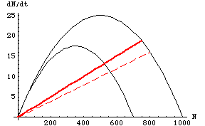
Fig. 29.7. Possible DI vs. DD regulation question. Question: Given the graph above, determine whether DD or DI will dominate, and explain your reasoning. [Answer is Fig. 29.8]
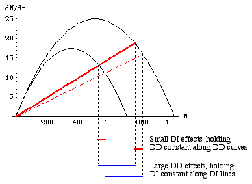
Fig. 29.8. Solution of the question graph in Fig. 29.7. Drop lines [the places where they hit the X-axis tell us the equilibrium population sizes] and an explanation of the horizontal bars connecting them are a sufficient explanation of the outcome. Here, the effects of changing DI conditions (red bars) is much less than the effect of changing DD conditions (blue bars), so DD dominates.
§§§§ §§§§§§§§§§§ §§§§§§§§§§§§§ §§§§§§§§§§§§§§§§§§§§§§§§§§§§§§§§§§§
Return to top of page Go forward to Lecture 30 , 12-Apr-13