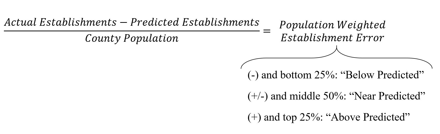
We produce a model of each sector based on information from a variety of sources. The model predicts how many businesses of each type we would expect to find in a given county. Counties are divided into one of three categories based on the difference in the predicted number of establishments and the actual number of establishments in that county. This establishment error is then weighted by the county’s population so that the inherently larger differences in more populated counties do not bias the results. The three categories identify those counties whose “population weighted establishment error” is in the bottom 25% (“Below Predicted”), middle 50% (“Near Predicted”), and top 25% (“Above Predicted”) of all US counties in 2014.
It is important to remember that these categories simply measure differences in the actual number of establishments and the number of establishments that the model predicts. In this sense, the performance categories do not reveal how well an industry is performing in a county, but rather where unrecognized barriers or opportunities may exist. For example, a particularly harmful state policy may be burdensome for an industry, but since the model accounts for individual state effects, it makes its predictions in spite of the state’s policy. In other words, the maps only identify where opportunities or threats may exist, and must be paired with local insider knowledge to be properly interpreted.
Here are some interpretations and ways the industry performance maps may guide you:
Blue (dark) County: Accounting for the current economic environment, this county still contains more establishments in this industry than expected. Given this information, use your local insider knowledge to determine if this implies A) a strong industry that is the result of unique local assets or B) a disappearing industry that may benefit from future consolidation.
White County: Accounting for the current economic environment, this county contains about the number of establishments in this industry as expected. Given this information, use your local insider knowledge to determine if this implies A) the local industry is a healthy size or B) the industry is not taking advantage of local strengths and should be larger.
Yellow (light) County: Accounting for the current economic environment, this county still contains fewer establishments in this industry than expected. Given this information, use your local insider knowledge to determine if this implies A) barriers preventing the growth of a beneficial industry or B) a neighboring (possibly metropolitan) county has many establishments in this industry and residents are willing to commute to access the neighboring cluster.
Note: some maps' "under-" or "overperforming" categories may contain less than 25% of the sample due to very few counties with negative or positive establishment errors. This likely means that the model is missing a piece of information leading it to routinely under or over predict the establishments, meaning very few counties with negative or positive establishment errors. These industries include: Supermarkets, Liquor Stores, Art Dealers, Family Planning Centers, and Paint and Adhesive Manufacturers.
One of the model inputs for several sectors is the social capital index, a measure of how well people in a county stick together. Note that details on the social capital index can be found here: Rupasingha, A., Goetz, S. J., & Freshwater, D. (2006, with updates). The production of social capital in US counties. Journal of Socio-Economics, 35, 83-101. doi:10.1016/j.socec.2005.11.001.
Economic Opportunity Maps Methodology Discussion Guide User's Guide