
Pasting as Plain Text
Never copy and paste into Modern Campus CMS directly from an external source (such as Microsoft Word, other web pages, etc.) Always copy your desired text, paste it into a plain format editor such as Notepad (Windows) or TextEdit (OS), recopy the text and then paste it into your cms editor. This ensures extraneous formatting is not accidentally copied into hidden HTML code within your web page which can be difficult to eliminate by standard site editors. You can also enable the "Paste as Text" (clipboard with a T) icon located on your WYSIWYG toolbar to help preserve styling.
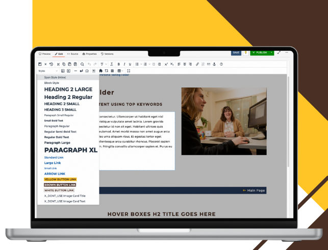
Heading Styles
Heading styles are predefined text formats that create a visual hierarchy on webpages. They help organize content for both readers and search engines while ensuring accessibility by allowing screen readers to navigate through page sections efficiently. Headings should be used sparingly and placed where you want to create strong visual emphasis while maintaining proper heading hierarchy to ensure accessibility.
Important Note: Do not change heading styles in your templates. These are pre-formatted to be accessible by screen readers and doing so can create digital accessibility violations. If you find an accessibility error in your template when turning off sections, please open a Request Help Ticket inside the CMS.
Heading 2 Large
Heading 2 Regular
Heading 2 Small
Heading 3 Small
Paragraph Styles
The most common type of text formatting on a page is Paragraph. Since this is the default format, all you need to do is type your words and press Return (OS) or Enter (Windows) to create this formatting. Paragraph text can then be formatted to be bolded, italicized, hyperlinked, bulleted, etc. This is also the default format of text when you first add words onto your page. For help formatting your standard text with some of these options, visit our WYSIWYG toolbar tutorial.
Paragraph Small Regular text is ideal for bulleted text.
Small Bold Text is ideal for emphasis on words within bulleted text.
Paragraph Regular text is ideal for standard text across all snippets.
Regular Semi-Bold Text is ideal for emphasizing words in Paragraph Regular text.
Regular Bold Text is ideal for emphasizing words in Paragraph Regular text.
Paragraph Large Text is ideal for emphasizing content and drawing users' attention without breaking the flow with a new heading or section.
Paragraph XL text is ideal for drawing users' attention while keeping content within the same section, without the need for a heading.
Link Styles
Hyperlinks within text can be used to direct users to related pages, reference supporting information or guide them to tools and resources that enhance their understanding or next steps. When hyperlinking text within a paragraph, always use clear, descriptive language that tells users exactly what they’ll find if they follow the link. Avoid vague phrases like click here, here, link, this link, more, read more, or learn more on their own as these do not provide meaningful context for screen readers or users scanning a page.
The Standard Link style should be used when creating a hyperlink within Paragraph Regular text (default text in snippets).
The Large Link should be used within text that has Paragraph Large styling.
The Small Link style should be used within small text, such as text found in bullet lists.
The arrow link draws attention and visually indicates that users will navigate to another page or section. They should be placed on their own line to maintain proper visual hierarchy and ensure they stand out from surrounding content.
Button Links
The Button component is a simple, reusable call-to-action (CTA) element used across our redesigned templates. This button is styled according to UW’s updated branding and allows editors to add a consistent, accessible link to any page section. Use action-oriented language like "Begin Your Journey," "Learn More" or "Attend an Event" rather than generic phrases like "Click Here," keeping text concise and specific about what happens next. This button is ideal for linking to primary calls to actions including forms, resources or contact pages where you want to draw attention and encourage users to take action.
This high action button features UW's standard branded yellow with brown text. When you hover over it, the text changes to white and the background becomes brown.
This medium action button displays white text on UW's standard branded brown background. When hovered over, the colors flip to brown text on a white background.
This low action button displays brown text on a white background. When you hover over it, the background changes to UW's standard branded yellow while the text remains brown.
The University of Wyoming has earned its Research Level 1 (R1) status from the Carnegie Classification of Institutions of Higher Education, placing Wyoming's only four-year university with the top research universities in the United States.