
Editing built-in Buttons & Arrow Links
Many templates include a call-to-action (CTA) button or arrow hyperlink already styled into the design for consistency and clarity. Both work as strong visual CTAs, with slightly different purposes. Use the built-in versions whenever possible, since they're easier to edit and already optimized for accessibility and design consistency. Preserving them keeps your page visually consistent, is easy to maintain through future updates and will keep your page accessible.
When editing these pre-formatted elements:
- Don't remove them or replace them with custom styles outside of the built-in buttons
and arrow links.
- Don't adjust spacing. It's already built into the design.
- Update the text and link destination only.
How to Edit and Remove Buttons and Arrow Links
Place your cursor in the middle of the button or arrow link text. Don't highlight or delete the text.
Click the link icon in the WYSIWYG toolbar to open the Insert/Edit Link window.
Use the Source button to select a new dependency tag or enter an external URL.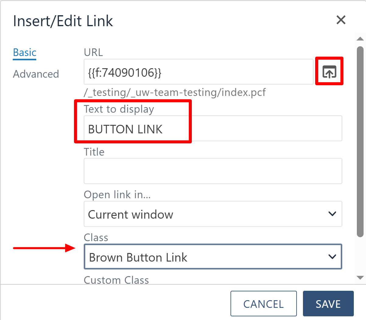
Update the "Text to Display" field to change the button or arrow link text.
If needed, change the button's color or style using the Class dropdown. Available classes: Standard Link, Large Link, Small Link, Arrow Link, Yellow Button Link, Brown Button Link, White Button Link.
Note: Stick to the default button styles inside your templates to preserve the intended visual hierarchy.
- Place your cursor in the middle of the button or arrow link text. Don't highlight
or delete the text.
- Click the broken link icon in the WYSIWYG toolbar to remove the link and strip out
its styling, clearing any
leftover HTML. - Delete the remaining text in the snippet where the button was.

Adding a Button That Isn't Built In
Use the Button component when you need to add a button in an area without a preloaded one, such as a longer One Column Text section. A simple menu lets you set the color, link and alignment. Stick to one button per section. Multiple buttons in a single content area clutter the design and confuse visitors.
Using the Button Component
The following options inside the button component can be added:
Button Style
Use the dropdown to choose from three branded styles:
- Yellow (UW signature gold)
- White (brown border)
- Brown (UW’s signature dark brown)
Button Text
Enter the action-oriented phrase that will display on the button (e.g., “Apply Now,” “Learn More,” “Register”).
Button Link
Paste or use the file chooser to insert the external URL or internal dependency tag
link for the button. This is where users will be directed when they click.
Button Link Target
Choose whether the link should open in:
- Same Tab (recommended for internal UW pages)
- New Tab (recommended for external sites or documents)
Button Alignment
Decide how the button should be aligned within its content block:
- Left
- Right
- Center
Once all fields are complete, click Save to apply your changes.
Using the Stlyes menu
If the text for your button is already written in an editing region, you can convert
it in place. Highlight the text you want to turn into a button, open the Styles drop
down in the WYSIWYG toolbar and select one of the button style options. Save the page
to apply your changes.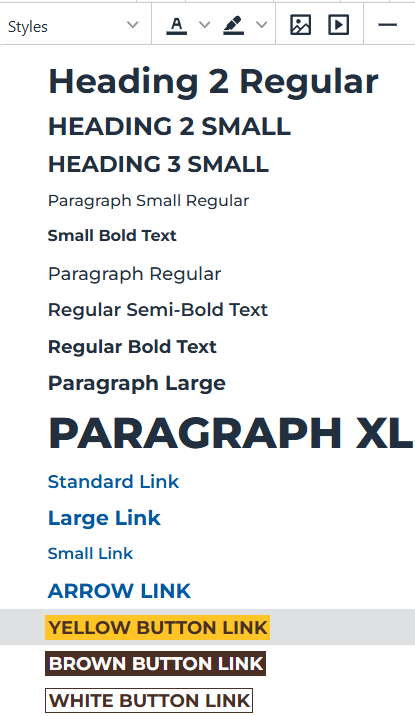

The University of Wyoming has earned its Research Level 1 (R1) status from the Carnegie Classification of Institutions of Higher Education, placing Wyoming's only four-year university with the top research universities in the United States.